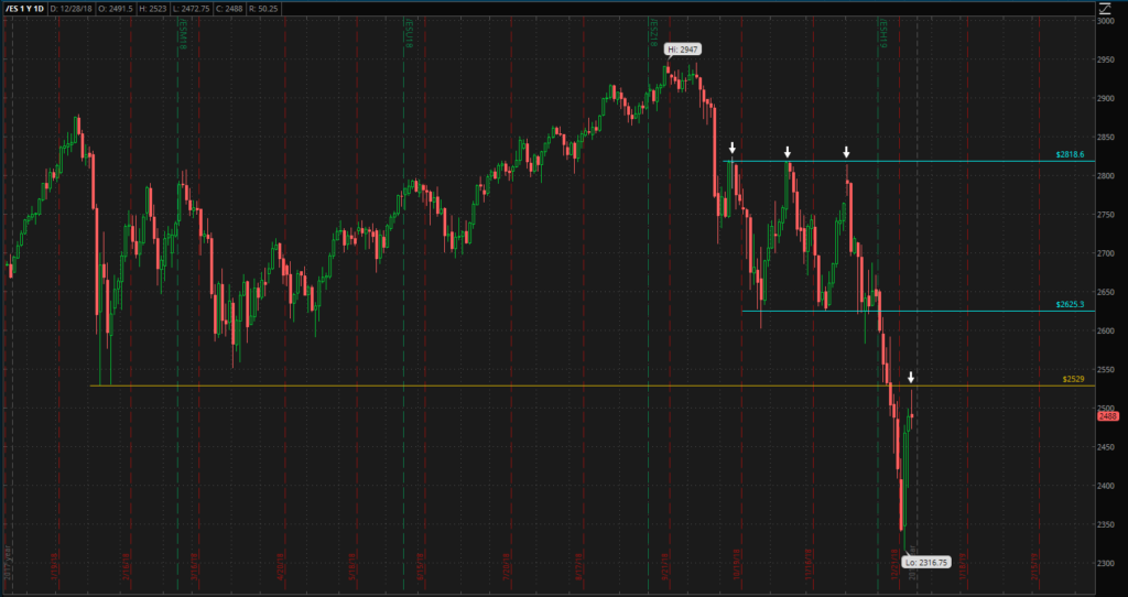
We hope everyone had a nice holiday and is looking forward to the new year. The market recently bounced off lows with all major indices posting at least 4.5% gains the day after Christmas, a substantial of which was realized towards the end of the trading session. The following day, every index appeared ready to head their way back towards the open of the 26th, but once again posted a stellar rally towards the end of the trading session.
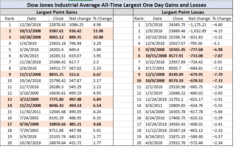
Table 1 – Largest Point Gains and Losses in DJIA[/caption]Today has been somewhat of a different story. All indices gave up the possibility of posting gains. Please reference Figure 1, the S&P 500 futures chart; the close of today seems all to familiar, but we want you to be weary of our mentioning this. Monday is going into the close of the year and with how wildly the market seems to enjoy swinging as of late, it could be an interesting session. Additionally, as institutions and funds allocate capital at the beginning of the new fiscal year, we anticipate an exciting start of the year, one way or another. Stay tuned.
We mentioned in a pre-holiday comment that we are leaning bearish and we are still holding to that thesis. While there are a multitude of reasons for our stance, we would like to present some surface level information, which you will hopefully find helpful. First and foremost is the fact that the Dow posted the largest ever point rally (not percentage). However, while at a glance this might seem like a good thing, we caution you. Take a look at Table 1 and reference the years in which the Dow also posted its largest gains. 2000-02, 08-09 and post recession 10-11 all saw the largest gains in the industrial index. This is interesting, especially since we don’t have to be ones to tell you what happened in 00-02, nor 08-09 (and we are not in the handful of years post-recession with the Fed easing its fiscal policy). Our eyebrows have been raised… But still not convinced.
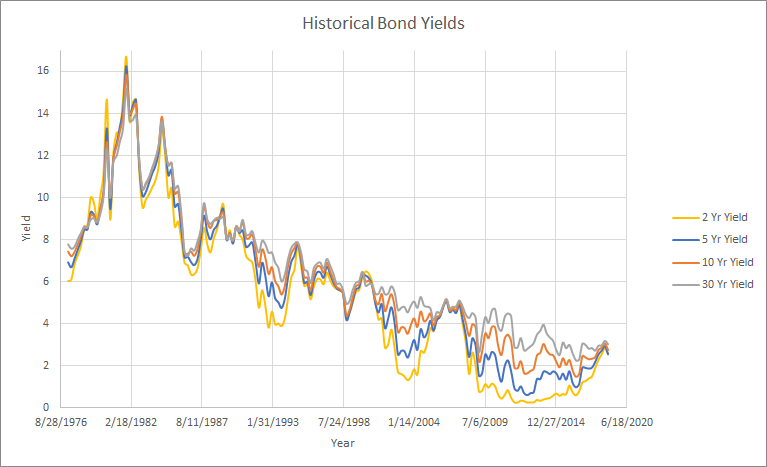
As additional information, we present the historical yield curve. The yield curve has knowingly become flatter and flatter, seen in Figure 2, an implication that there is a stronger demand from investors for longer-term bonds which are utilized as a less-risky investment over shorter-term bonds or stocks. While the yield curve flattening does not necessarily mean a recession is coming, as indicated by the number of times it has and a recession has not followed, it can cause further raising of the eyebrows… But still not convinced.
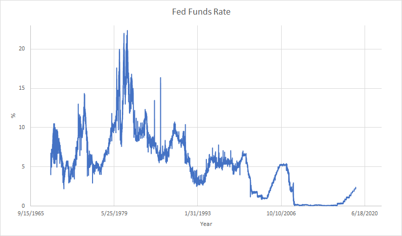
Now the historical Fed funds rate, shown in Figure 3, is worth a mention as well, simply because a possible approach to loosening fiscal policy is to reduce short-term interest rates (there are a plethora of factors considered other than just the fact that there is a recession). However, it’s fairly apparent that while the Fed has been increasing rates, thus tightening policy, the rate has not seen much of an increase, especially considering the long stretch at just above 0. Another method the Fed can use to ease policy is to pump money into the economy through Quantitative Easing (QE). The Feds recently finished this program under Janet Yellen and have begun Quantitative Tightening (QT). Powell, the current chairman, has stated there were no plans to go back to a QE, while another Fed chairman contradicted his statements (We believe it was the chairman of the St. Louis Fed – please fact check us!). So there are really only a few tools the Fed can use to re-stimulate the economy in the event of a recession… We recently heard an interesting conjecture that Powell was intentionally hiking rates knowing this could cause a recession, simply to have room to take rates to take off the table in the event a recession eventually occurs. Interesting… Not sure where our eyebrows are anymore.
While we cannot confidently say there will be a recession, and we are aware we spoke poorly of some individuals who were spouting off about one “in the future” (albeit they have been doing so for a very long time with no data to back it up), global markets change rapidly. Here at DAM we analyze information as the market presents it and position ourselves within the marketplace given this information. Things have changed enough over the past 2 and a half months to begin taking a look at things differently and acknowledge the possibility of a recession.
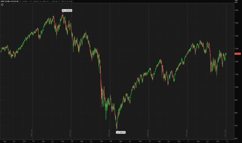
A recession is defined as 2 consecutive quarters of negative GDP. We would like to mention that the economy did not posted negative GDP growth until Q1 of 2008. The market had already fallen off highs before the number was even officially available. GDP actually grew through Q2 and Q3 of 2008 until Q4 when GDP growth was negative for next 3 consecutive quarters. The final chart included is the S&P 500 from 1/1/05 to 1/1/12. Equities predicted the recession and established a low before the final negative GDP growth from Q1
2009 was even completed… Now we’re thoroughly skeptical.
“If we acted, nobody would thank us. But if we did not act, who would?” – Ben Bernanke
